
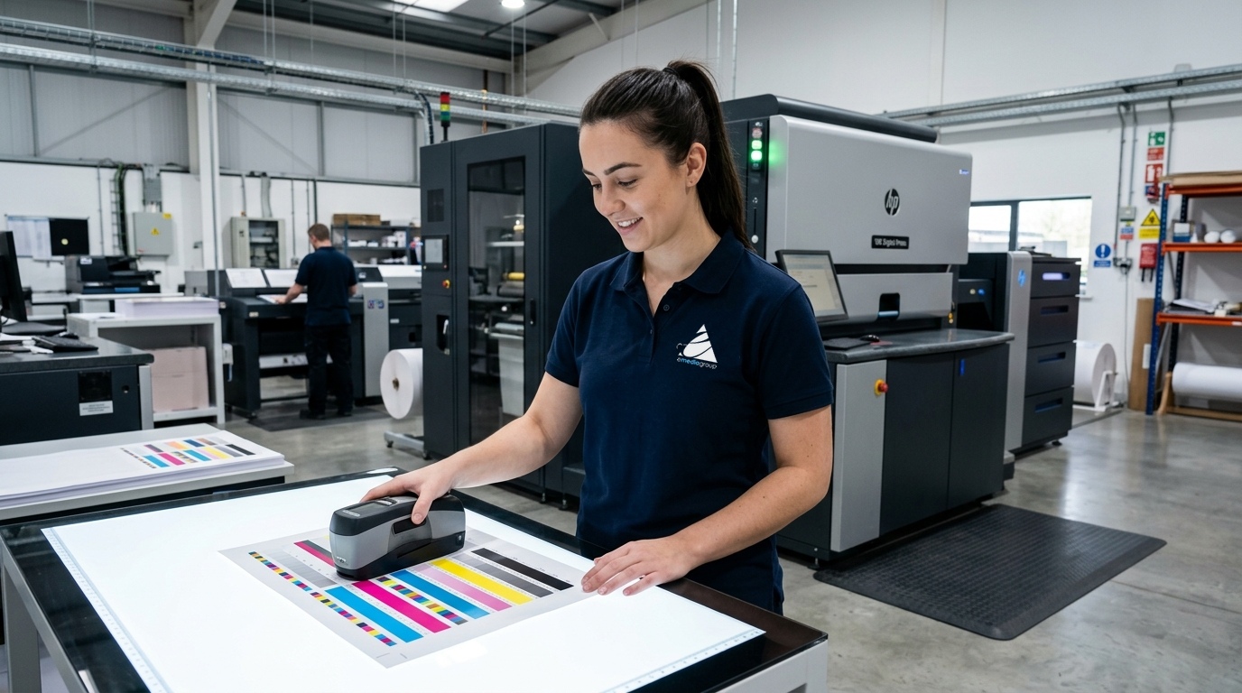
Your corporate logo should never look navy blue on an annual marketing brochure, royal blue on an endurance race bib, and lavender purple on an event banner. Yet without rigorous, standardized color management, that is precisely what happens when marketing campaigns span multiple production facilities, presses, and physical materials.
As a leading G7 certified printer in Greenville, SC, emediagroup eliminates the guesswork from commercial printing. G7-certified processes bring predictable, scientific color calibration across disparate production presses, synthetic substrates, rigid signage, and vehicle vinyls—protecting the brand equity your organization works tirelessly to build.
Color Is the Core of Your Brand Identity
Customers consistently recognize a brand’s signature color before they register its company name or typography. Think of Target red, Home Depot orange, or Tiffany blue—these hues instantly evoke trust, familiarity, and perceived quality. When your brand colors shift across different customer touchpoints, it subtly erodes brand credibility and suggests disorganized execution.
The manufacturing challenge is that physical substrates—such as coated litho paper, DuPont™ Tyvek® race bibs, polyester fabrics, cast vinyl films, inks, toners, ambient lighting, and press mechanics—do not absorb or reflect light in the same manner. An RGB color that appears radiant on an Apple Retina display can dramatically drift when converted to ink on a porous substrate. A controlled, scientific color-management system bridges that gap.
What Does G7® Mean in Commercial Printing?
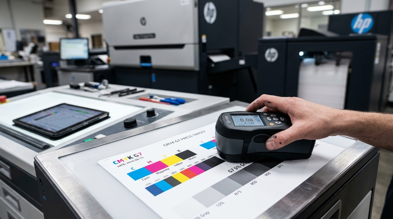
G7® is an internationally recognized specification defined by Idealliance that aligns printing devices across all imaging technologies based on visual neutral gray balance and tonal transfer curves (NPDC), rather than subjective operator adjustments.
Historically, commercial print operators calibrated presses using dot gain (TVI) measurements, which varied wildly between offset presses, flexographic machines, and digital toner systems. G7 revolutionized the industry by focusing on how the human eye actually perceives color harmony:
- The "G" stands for Gray: G7 establishes a universal visual target for neutral gray balance by balancing 50% Cyan with 40% Magenta and 40% Yellow. If your neutral grays are in perfect balance, all photographic mid-tones, skin tones, and corporate colors align naturally.
- The "7" stands for the 7 Primary Colors: Strict colorimetric tolerances are measured and enforced across Cyan, Magenta, Yellow, Black (CMYK), and the two-color overprints Red, Green, and Blue (RGB).
- Objective Spectrophotometric Measurement: Rather than relying on press operators squinting at proof sheets under shop lights, G7 technicians utilize digital spectrophotometers to measure precise spectral data (Delta-E tolerances), guaranteeing mathematical repeatability.
Achieving Brand Consistency Across Diverse Materials
Modern marketing campaigns rarely rely on a single print format. A major endurance athletic event demands custom Tyvek marathon bibs, mesh perimeter fence banners, coroplast directional signs, participant tech shirts, and direct mail flyers. A commercial grand opening requires architectural window graphics, commercial fleet vehicle wraps, presentation folders, and point-of-sale displays.
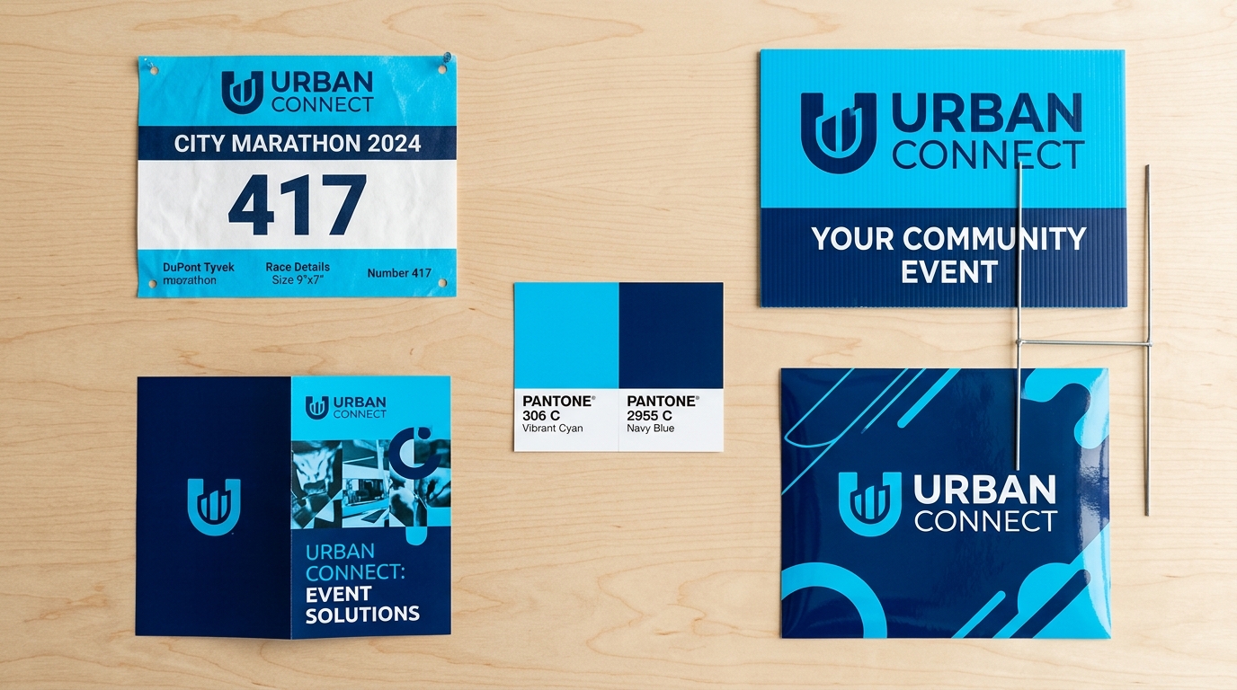
Because physical substrates possess distinct optical brighteners, surface textures, and ink absorption rates, achieving 100% molecular color identity across plastic, cotton, and paper is physically impossible. However, an Idealliance G7-certified workflow establishes a shared, calibrated visual target. The resulting collateral looks like one coordinated brand family—not items sourced from five unrelated vendors.
Navigating PMS Spot Colors, CMYK Gamuts, and Digital Presses
A Pantone Matching System (PMS) spot color provides an exact physical ink formulation for brand identity. Depending on production quantities, project requirements, and turnaround schedules, colors are reproduced using different manufacturing methodologies:
- Commercial Offset Presses: For high-volume catalogs or corporate stationery, custom physical inks can be mixed to exact Pantone formulas and run on dedicated press units.
- High-Speed Digital Presses: On short runs and variable-data projects, high-definition digital presses simulate Pantone swatches using expanded 4-color to 7-color toner and electro-ink gamuts calibrated to G7 gray balance.
- Wide-Format Latex & UV Inks: Large format banners and vehicle wraps utilize advanced ICC color profiles tuned to specific vinyl and laminate combinations to achieve the closest possible Delta-E match to your brand guidelines.
Pro Tip: Always provide your official brand standards guide detailing PMS spot colors, CMYK formulas, sRGB values, and web HEX codes. Our pre-press engineering team evaluates the substrate and selects the optimal rendering intent for every order.
How Marketing Teams Can Protect Brand Colors
Ensuring color accuracy starts long before files hit our production floor. Here are best practices every creative agency, brand director, and event organizer should follow:
- Submit Native Vector Artwork: Always provide vector files (.AI, .EPS, or vector .PDF) with text converted to outlines. Avoid copying logos from website headers, email signatures, or pixelated screenshots.
- Specify PMS Spot Colors Upfront: Clearly identify critical brand colors in your artwork layers and quote requests so our pre-press team can lock in target values.
- Review Proofs in Standardized Lighting: Evaluate physical press proofs under D50 (5000K) daylight-balanced lighting. Office fluorescent bulbs and warm residential LED lamps distort visual color perception (metamerism).
- Request Hard-Copy Contract Proofs: When launching high-stakes corporate rebranding campaigns or million-dollar events, request a calibrated physical contract proof on the actual production substrate.
- Archive Approved Production Samples: Retain signed, approved physical samples to serve as visual benchmarks for all future reorders.
Choose Scientific Repeatability, Not Press Floor Guesswork
Consistent, award-winning print quality does not happen by accident. It is not the result of a single press operator making an intuitive knob adjustment on a good day. It is the direct outcome of certified equipment, documented color curves, premium substrates, and rigorous spectrophotometric verification on every run.
At emediagroup, our production floor maintains G7 Master Certified processes to guarantee that whether you order commercial marketing brochures, 50,000 endurance race bibs, or custom fleet wraps, your brand colors look precise, vibrant, and identical order after order.
Have a color-critical commercial print or event project? Call our Greenville production facility directly at 877.866.7223 or connect with our pre-press team online through our contact portal.

0 Comments